🍒 오늘은 여기까지..
1. 팀프로젝트 깃 레포 다시 생성
2. 메인페이지(어제)-펀딩 상세페이지(오늘) view까지만 구현
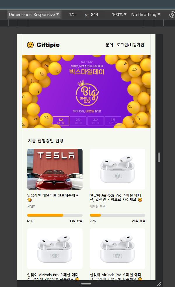
✅ 메인페이지 view
import React from 'react';
import { useNavigate } from 'react-router-dom';
import {
    MainContainer,
    LeftContainer,
    Logo,
    P,
    Button,
    RightContainer,
    Navbar,
    NavbarBtn,
    NavbarBtnDiv,
    Body,
    BannerImg,
    FundingDiv,
    FundingSection,
    FundingGrid,
    FundingImg,
    // FundingNewline,
    ProgressBar,
    Progress,
    BetweenDiv,
    TogatherDiv,
    Footer,
} from './HomeStyles';

// 이미지 크기 조정 함수
// const resizeImg = (imgFile) => {
//   const maxWidth = 200;
//   const maxHeight = 140;

//   // canvas element를 생성하고 2D Context를 얻음
//   const canvas = document.createElement("canvas");
//   const ctx = canvas.getContext("2d");

//   // img element를 생성하고 입력 이미지 파일로 설정
//   const img = new Image();
//   img.src = URL.createObjectURL(imgFile);

//   // 조절된 이미지 Blob으로 resolve되는 Promis를 반환
//   return new Promise((resolve) => {
//     img.onload = () => {
//       let width = img.width;
//       let height = img.height;

//       // 이미지 높이가 140보다 작은 경우, 높이를 140으로 확장
//       if (height < maxHeight) {
//         width *= maxHeight / height;
//         height = maxHeight;
//       }

//       // 이미지 높이가 140보다 큰 경우, 높이를 140으로 축소
//       if (height > maxHeight) {
//         width *= maxHeight / height;
//         height = maxHeight;
//       }

//       canvas.width = maxWidth;
//       canvas.height = maxHeight;

//       // 이미지 가운데 정렬
//       const xOffset = (maxWidth - width) / 2;
//       const yOffset = (maxHeight - height) / 2;
//       canvas.width = maxWidth;
//       canvas.height = maxHeight;
//       ctx.drawImage(img, xOffset, yOffset, width, height);

//       // canvas 내용을 Blob으로 변환하고 Promise를 resolove
//       canvas.toBlob((blob) => {
//         resolve(blob);
//       }, imgFile.type);
//     };
//   });
// };

// 이미지 크기 조절
// const resizedImgBlob = await resizeImg(fundingImg);

// FormData를 사용하여 이미지와 데이터를 서버에 전송
// const formData = new FormData();
// formData.append("fundingImg", resizedImgBlob);
// formData.append("fundingTitle", fundingTitle);
// formData.append("fundingContents", fundingContents);

const Home = () => {
    const navigate = useNavigate();

    const meta = document.createElement('meta');
    meta.name = 'viewport';
    meta.content = 'width=device-width, initial-scale=1.0, maximum-scale=1.0, user-scalable=no, viewport-fit=cover';
    document.getElementsByTagName('head')[0].appendChild(meta);

    return (
        <MainContainer>
            <LeftContainer>
                <Logo>😉 Giftipie</Logo>
                <P pt="25px" fs="16px" fw="800" pb="5px">
                    기프티파이에서
                </P>
                <P fs="16px" fw="800" pb="5px">
                    정말 원하는 선물을
                </P>
                <P fs="16px" fw="800">
                    주고 받아요
                </P>
                <Button onClick={() => navigate('/')}>펀딩 시작하기</Button>
            </LeftContainer>

            <RightContainer>
                <Navbar>
                    <NavbarBtn fs="20px" fw="800" pl="15px">
                        😉 Giftipie
                    </NavbarBtn>
                    <NavbarBtnDiv pr="15px">
                        <NavbarBtn fs="13px" fw="600">
                            문의
                        </NavbarBtn>
                        <NavbarBtn fs="13px" fw="600">
                            로그인/회원가입
                        </NavbarBtn>
                    </NavbarBtnDiv>
                </Navbar>

                <Body>
                    <BannerImg src="/imgs/banner.png" alt="logo" />
                    <FundingDiv>
                        <P pt="30px" pl="20px" fs="14px" fw="800">
                            지금 진행중인 펀딩
                        </P>
                        <FundingSection>
                            <FundingGrid onClick={() => navigate('/fundingdetail')}>
                                <FundingImg src="/imgs/airpodspro.jpeg" alt="logo" />
                                <P pt="10px" fs="12px" fw="800">
                                    설맞이 AirPods Pro 스페셜 에디션, 갑진년 기념으로 사주세요 😘
                                    {/* <FundingNewline></FundingNewline> */}
                                </P>
                                <P pt="10px" fs="10px" fw="800" color="gray">
                                    에어팟 프로
                                </P>
                                <ProgressBar>
                                    <Progress width={(65 / 100) * 100} />
                                </ProgressBar>
                                <BetweenDiv>
                                    <P pt="8px" fs="10px" fw="800">
                                        65%
                                    </P>
                                    <P pt="8px" pl="90px" fs="10px" fw="800">
                                        13일 남음
                                    </P>
                                </BetweenDiv>
                            </FundingGrid>
                            <FundingGrid onClick={() => navigate('/fundingdetail')}>
                                <FundingImg src="/imgs/airpodspro.jpeg" alt="logo" />
                                <P pt="10px" fs="12px" fw="800">
                                    설맞이 AirPods Pro 스페셜 에디션, 갑진년 기념으로 사주세요 😘
                                </P>
                                <P pt="10px" fs="10px" fw="800" color="gray">
                                    에어팟 프로
                                </P>
                                <ProgressBar>
                                    <Progress width={(20 / 100) * 100} />
                                </ProgressBar>
                                <BetweenDiv>
                                    <P pt="8px" fs="10px" fw="800">
                                        20%
                                    </P>
                                    <P pt="8px" pl="90px" fs="10px" fw="800">
                                        28일 남음
                                    </P>
                                </BetweenDiv>
                            </FundingGrid>
                        </FundingSection>
                    </FundingDiv>
                    <TogatherDiv>
                        <P pt="30px" pl="30px" fs="14px" fw="800">
                            Giftipie에서 함께 하는 기쁨
                        </P>
                        <BetweenDiv>
                            <P pt="40px" pl="30px" fs="13px" fw="800">
                                펀딩에 참여한 사람
                            </P>
                            <P pt="40px" pr="30px" fs="13px" fw="800">
                                11명
                            </P>
                        </BetweenDiv>
                        <BetweenDiv>
                            <P pt="20px" pl="30px" fs="13px" fw="800">
                                선물을 받은 사람
                            </P>
                            <P pt="20px" pr="30px" fs="13px" fw="800">
                                11명
                            </P>
                        </BetweenDiv>
                        <BetweenDiv>
                            <P pt="20px" pl="30px" fs="13px" fw="800">
                                모인 펀딩 금액
                            </P>
                            <P pt="20px" pr="30px" fs="13px" fw="800">
                                89,345,000원
                            </P>
                        </BetweenDiv>
                    </TogatherDiv>
                </Body>
                <Footer>Footer</Footer>
            </RightContainer>
        </MainContainer>
    );
};

export default Home;
import styled from "styled-components";
// 전체 컨테이너
export const MainContainer = styled.div`
display: flex;
justify-content: center; // 수정함
/* width: 1200px; */
max-width: 1200px; // 수정함
min-height: 100vh;
margin: 0 auto;
flex-wrap: wrap;
`;
// 왼쪽 컨테이너
export const LeftContainer = styled.div`
display: flex;
flex-direction: column;
justify-content: center;
align-items: center;
width: 500px;
height: 100vh;
padding: 20px;
border: 1px solid lightgray;
border-radius: 8px;
margin-right: 100px;
@media (max-width: 1024px) {
display: none;
}
`;
export const Logo = styled.h1`
font-size: 24px;
font-weight: 800;
`;
export const P = styled.p`
padding-top: ${(props) => props.pt};
padding-bottom: ${(props) => props.pb};
padding-left: ${(props) => props.pl};
padding-right: ${(props) => props.pr};
font-size: ${(props) => props.fs};
font-weight: ${(props) => props.fw};
color: ${(props) => props.color};
align-items: center;
`;
export const Button = styled.button`
justify-content: center;
align-items: center;
width: 200px;
height: 50px;
padding: 10px;
background-color: orange;
border-radius: 7px;
color: white;
font-size: 15px;
font-weight: 600;
margin-top: 30px;
margin-bottom: 20px;
&:hover {
color: white;
background-color: violet;
cursor: pointer;
}
`;
// 오른쪽 컨테이너
export const RightContainer = styled.div`
position: relative;
/* width: 470px; */
width: 442px;
/* margin-left: auto; */
border: 1px solid lightgray;
/* @media (max-width: 1024px) { */
@media (max-width: 442px) {
width: 100%;
}
`;
// 네브바 영역
export const Navbar = styled.div`
display: flex;
flex-direction: row;
justify-content: space-between;
align-items: center;
height: 70px;
`;
export const NavbarBtn = styled.button`
font-size: ${(props) => props.fs};
font-weight: ${(props) => props.fw};
padding-left: ${(props) => props.pl};
padding-right: ${(props) => props.pr};
`;
export const NavbarBtnDiv = styled.div`
flex-direction: row;
padding-right: ${(props) => props.pr};
`;
// 바디 영역
export const Body = styled.div`
font-size: 24px;
font-weight: 800;
height: 1500px;
`;
export const BannerImg = styled.img`
width: 100%;
/* max-width: 470px; */
max-width: 442px;
height: auto;
`;
export const FundingDiv = styled.div`
justify-content: center;
width: 100%;
/* max-width: 470px; */
max-width: 442px;
height: auto;
`;
export const FundingSection = styled.div`
display: flex;
justify-content: space-around;
flex-wrap: wrap;
/* width: 100%; */
gap: 10px;
padding: 10px;
`;
export const FundingGrid = styled.div`
/* width: 200px; */
/* width: 195px; */
width: 100%;
max-width: 190px;
/* @media (max-width: 470px) { */
/* @media (max-width: 195px) {
width: 100%; // FundingGrid가 부모 컨테이너에 꽉 차도록 설정
} */
`;
export const FundingImg = styled.img`
/* width: 200px; */
max-width: 190px;
max-height: 140px;
width: 100%;
height: 100%;
border-radius: 8px;
margin-top: 10px;
`;
export const FundingNewline = styled.div`
width: 100%;
height: 12px;
`;
export const ProgressBar = styled.div`
width: 100%;
height: 10px;
background-color: #dedede;
border-radius: 12px;
font-weight: 600;
font-size: 0.8rem;
margin-top: 20px;
overflow: hidden;
`;
export const Progress = styled.div`
width: ${(props) => props.width}%;
height: 10px;
padding: 0;
text-align: center;
background-color: orange;
border-radius: 15px; // 추가
color: #111;
`;
export const BetweenDiv = styled.div`
display: flex;
flex-direction: row;
justify-content: space-between;
`;
export const TogatherDiv = styled.div`
margin-top: 20px;
/* width: 470px; */
width: 442px;
/* height: 200px; */
height: 210px;
background-color: orange;
`;
export const Footer = styled.div`
border: 1px solid lightgray;
font-size: 24px;
font-weight: 800;
height: 80px;
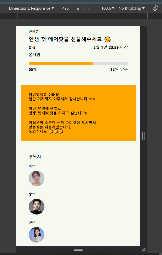
`;✅ 펀딩 상세페이지 view
import React from 'react';
import {
MainContainer,
LeftContainer,
Logo,
P,
Button,
RightContainer,
Navbar,
NavbarBtn,
NavbarBtnDiv,
Body,
BannerImg,
FundingDiv,
FundingSection,
FundingGrid,
FundingImg,
SponsorImg,
ProgressBar,
Progress,
BetweenDiv,
TogatherDiv,
Footer,
} from './FundingDetailStyles';
const FundingDetail = () => {
const meta = document.createElement('meta');
meta.name = 'viewport';
meta.content = 'width=device-width, initial-scale=1.0, maximum-scale=1.0, user-scalable=no, viewport-fit=cover';
document.getElementsByTagName('head')[0].appendChild(meta);
return (
<MainContainer>
<LeftContainer>
<Logo>😉 Giftipie</Logo>
<P pt="25px" fs="16px" fw="800" pb="5px">
기프티파이에서
</P>
<P fs="16px" fw="800" pb="5px">
정말 원하는 선물을
</P>
<P fs="16px" fw="800">
주고 받아요
</P>
<Button mt="20px" w="200px" h="50px" fs="17px" color="white">
펀딩 시작하기
</Button>
</LeftContainer>
<RightContainer>
<Navbar>
<NavbarBtn fs="20px" fw="800" pl="15px">
😉 Giftipie
</NavbarBtn>
<NavbarBtnDiv pr="15px">
<NavbarBtn fs="13px" fw="600">
문의
</NavbarBtn>
<NavbarBtn fs="13px" fw="600">
로그인/회원가입
</NavbarBtn>
</NavbarBtnDiv>
</Navbar>
<Body>
<BannerImg src="/imgs/airpodspro2.jpg" alt="image" />
<FundingDiv>
<P pt="20px" fs="13px" fw="800">
진행중
</P>
<P pt="10px" fs="20px" fw="900">
인생 첫 에어팟을 선물해주세요 😘
</P>
<BetweenDiv>
<P pt="10px" fs="15px" fw="800">
D-5
</P>
<P pt="10px" fs="15px" fw="800">
2월 1일 23:59 마감
</P>
</BetweenDiv>
<P pt="10px" fs="15px" fw="800">
윤다인
</P>
<ProgressBar>
<Progress width={(65 / 100) * 100} />
</ProgressBar>
<BetweenDiv>
<P pt="8px" fs="15px" fw="800">
65%
</P>
<P pt="8px" pl="90px" fs="15px" fw="800">
13일 남음
</P>
</BetweenDiv>
</FundingDiv>
<TogatherDiv bc="orange">
<P pt="30px" pl="30px" fs="14px" fw="800">
안녕하세요 여러분
<br />
일단 여기까지 와주셔서 감사합니다 ㅎㅎ
</P>
<P pt="20px" pl="30px" fs="14px" fw="800">
이번 20번째 생일로
<br />
인생 첫 에어팟을 가지고 싶습니다!!!
</P>
<P pt="20px" pl="30px" fs="14px" fw="800">
여러분의 소중한 선물 고이고이 모시면서
<br />
알뜰살뜰 사용하겠습니다.
<br />
도와주세요 😘😘😘
<br />
</P>
</TogatherDiv>
<FundingDiv>
<P pt="20px" fs="16px" fw="900">
후원자
</P>
<P pt="20px" fs="13px" fw="800">
아**
</P>
<SponsorImg src="/imgs/iu.jpg" alt="image" />
<P pt="20px" fs="13px" fw="800">
송**
</P>
<SponsorImg src="/imgs/songjoongy.jpg" alt="logo" />
<P pt="20px" fs="13px" fw="800">
전**
</P>
<SponsorImg src="/imgs/junjihyun.jpg" alt="logo" />
<P pt="20px" pl="160px" fs="14px" fw="800">
전체보기 ▶
</P>
</FundingDiv>
<FundingDiv>
<P pt="20px" fs="16px" fw="900">
펀딩 참여하기
</P>
<ProgressBar>
<Progress width={(36 / 100) * 100} />
</ProgressBar>
<BetweenDiv>
<P pt="8px" fs="15px" fw="800">
36%
</P>
<P pt="8px" pl="90px" fs="15px" fw="800">
210,500원 남았어요
</P>
</BetweenDiv>
<Button mt="30px" w="375px" h="60px">
<BetweenDiv>
<P pt="2px" pl="20px" fs="15px" fw="800" color="black">
커피 한잔 선물하기
</P>
<P pt="2px" pr="20px" fs="15px" fw="700" color="black">
5,000원
</P>
</BetweenDiv>
</Button>
<Button mt="10px" w="375px" h="60px">
<BetweenDiv>
<P pt="2px" pl="20px" fs="15px" fw="800" color="black">
파인트 아이스크림 선물하기
</P>
<P pt="2px" pr="20px" fs="15px" fw="700" color="black">
10,000원
</P>
</BetweenDiv>
</Button>
<Button mt="10px" w="375px" h="60px">
<BetweenDiv>
<P pt="2px" pl="20px" fs="15px" fw="800" color="black">
원하는만큼 선물하기
</P>
<P pt="2px" pr="20px" fs="15px" fw="700" color="black">
직접입력
</P>
</BetweenDiv>
</Button>
<Button mt="10px" w="375px" h="60px">
<BetweenDiv>
<P pt="2px" pl="20px" fs="15px" fw="800" color="black">
이 펀딩을 끝내러 왔다
</P>
<P pt="2px" pr="20px" fs="15px" fw="700" color="black">
210,500원
</P>
</BetweenDiv>
</Button>
</FundingDiv>
<TogatherDiv bc="violet">
<P pt="30px" pl="30px" fs="16px" fw="800">
Giftipie에서 함께 하는 기쁨
</P>
<BetweenDiv>
<P pt="40px" pl="30px" fs="13px" fw="800">
펀딩에 참여한 사람
</P>
<P pt="40px" pr="30px" fs="13px" fw="800">
11명
</P>
</BetweenDiv>
<BetweenDiv>
<P pt="20px" pl="30px" fs="13px" fw="800">
선물을 받은 사람
</P>
<P pt="20px" pr="30px" fs="13px" fw="800">
11명
</P>
</BetweenDiv>
<BetweenDiv>
<P pt="20px" pl="30px" fs="13px" fw="800">
모인 펀딩 금액
</P>
<P pt="20px" pr="30px" fs="13px" fw="800">
200,000원
</P>
</BetweenDiv>
</TogatherDiv>
<Button mt="30px" w="442px" h="70px" color="black" fs="19px">
선물하기
</Button>
</Body>
<Footer>Footer</Footer>
</RightContainer>
</MainContainer>
);
};
export default FundingDetail;import styled from "styled-components";
// 전체 컨테이너
export const MainContainer = styled.div`
display: flex;
justify-content: center; // 수정함
/* width: 1200px; */
max-width: 1200px; // 수정함
min-height: 100vh;
margin: 0 auto;
flex-wrap: wrap;
`;
// 왼쪽 컨테이너
export const LeftContainer = styled.div`
display: flex;
flex-direction: column;
justify-content: center;
align-items: center;
width: 500px;
height: 100vh;
padding: 20px;
border: 1px solid lightgray;
border-radius: 8px;
margin-right: 100px;
@media (max-width: 1024px) {
display: none;
}
`;
export const Logo = styled.h1`
font-size: 24px;
font-weight: 800;
`;
export const P = styled.p`
padding-top: ${(props) => props.pt};
padding-bottom: ${(props) => props.pb};
padding-left: ${(props) => props.pl};
padding-right: ${(props) => props.pr};
font-size: ${(props) => props.fs};
font-weight: ${(props) => props.fw};
color: ${(props) => props.color};
align-items: center;
`;
export const Button = styled.button`
justify-content: center;
align-items: center;
width: ${(props) => props.w};
height: ${(props) => props.h};
padding: 10px;
background-color: orange;
border-radius: 7px;
color: ${(props) => props.color};
font-size: ${(props) => props.fs};
font-weight: 600;
margin-top: ${(props) => props.mt};
margin-bottom: ${(props) => props.mb};
&:hover {
color: white;
background-color: violet;
cursor: pointer;
}
`;
// 오른쪽 컨테이너
export const RightContainer = styled.div`
position: relative;
/* width: 470px; */
width: 442px;
/* margin-left: auto; */
border: 1px solid lightgray;
/* @media (max-width: 1024px) { */
@media (max-width: 442px) {
width: 100%;
}
`;
// 네브바 영역
export const Navbar = styled.div`
display: flex;
flex-direction: row;
justify-content: space-between;
align-items: center;
height: 70px;
`;
export const NavbarBtn = styled.button`
font-size: ${(props) => props.fs};
font-weight: ${(props) => props.fw};
padding-left: ${(props) => props.pl};
padding-right: ${(props) => props.pr};
`;
export const NavbarBtnDiv = styled.div`
flex-direction: row;
padding-right: ${(props) => props.pr};
`;
// 바디 영역
export const Body = styled.div`
font-size: 24px;
font-weight: 800;
height: 2100px;
`;
export const BannerImg = styled.img`
width: 100%;
/* max-width: 470px; */
max-width: 442px;
height: auto;
`;
export const FundingDiv = styled.div`
justify-content: center;
width: 100%;
/* max-width: 470px; */
max-width: 442px;
height: auto;
padding: 30px;
`;
export const FundingSection = styled.div`
display: flex;
justify-content: space-around;
flex-wrap: wrap;
/* width: 100%; */
gap: 10px;
padding: 10px;
`;
export const FundingGrid = styled.div`
/* width: 200px; */
/* width: 195px; */
width: 100%;
max-width: 190px;
/* @media (max-width: 470px) { */
/* @media (max-width: 195px) {
width: 100%; // FundingGrid가 부모 컨테이너에 꽉 차도록 설정
} */
`;
export const FundingImg = styled.img`
/* width: 200px; */
max-width: 190px;
max-height: 140px;
width: 100%;
height: 100%;
border-radius: 8px;
margin-top: 10px;
`;
export const SponsorImg = styled.img`
/* width: 200px; */
width: 60px;
height: 60px;
border-radius: 100px;
margin-top: 10px;
`;
export const FundingNewline = styled.div`
width: 100%;
height: 12px;
`;
export const ProgressBar = styled.div`
width: 100%;
height: 10px;
background-color: #dedede;
border-radius: 12px;
font-weight: 600;
font-size: 0.8rem;
margin-top: 20px;
overflow: hidden;
padding-left: ${(props) => props.pl};
padding-right: ${(props) => props.pr};
`;
export const Progress = styled.div`
width: ${(props) => props.width}%;
height: 10px;
padding: 0;
text-align: center;
background-color: orange;
border-radius: 15px; // 추가
color: #111;
padding-left: ${(props) => props.pl};
padding-right: ${(props) => props.pr};
`;
export const BetweenDiv = styled.div`
display: flex;
flex-direction: row;
justify-content: space-between;
`;
export const TogatherDiv = styled.div`
margin-top: 20px;
/* width: 470px; */
width: 442px;
/* height: 200px; */
height: 215px;
background-color: ${(props) => props.bc};
`;
export const Footer = styled.div`
border: 1px solid lightgray;
font-size: 24px;
font-weight: 800;
height: 80px;
`;